Project outcomes
Over several weeks, our team conducted user interviews and translated research insights into iterative wireframes, high-fidelity designs, and interactive prototypes for both front and back end experiences. Each experience was tailored to users’ goals and workflows.
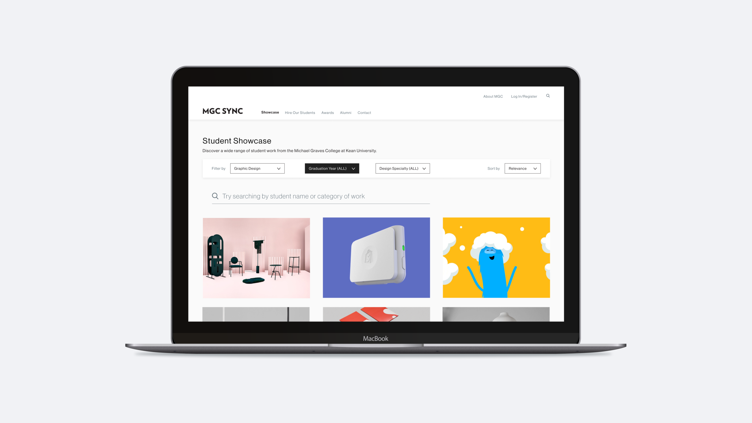
The front-end experience was designed to support four key user groups:
1.
Students and recent graduates
2.
Faculty members
3.
Recruiters and industry professionals
4.
Prospective students
The back end focused on students and recent graduates, providing streamlined tools for managing profiles, applications, and career resources.
What I learned
This project strengthened my ability to quickly adapt to new tools and establish efficient, scalable workflows as our team transitioned to Figma from Sketch and Adobe XD. I learned how to leverage collaborative design systems and real-time feedback to accelerate iteration and maintain quality.
I also developed stronger leadership and collaboration skills by facilitating regular check-ins, aligning on priorities, and navigating trade-offs to deliver user-centered solutions that balanced usability, feasibility, and long-term impact.