INTRODUCTION
Crafting a streamlined experience of MGC Sync
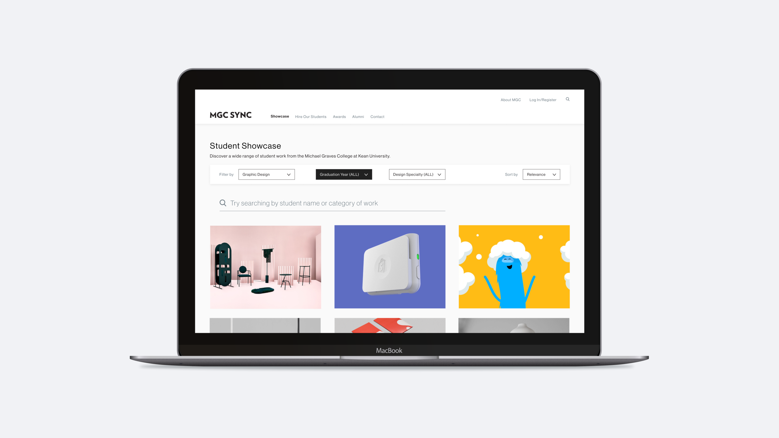
MGCSync.com is a website created in 2017 by Professor Denise Anderson and students in the Michael Graves College. Its purpose is to connect students via portfolio profiles to creative recruiters, industry professionals, and alumni for the purpose of identifying opportunities for employment, internships, and freelancing.
TEAM
Small team of four design students selected from the Robert Busch School of Design at Kean University
MY ROLE
In January of 2020, I was selected by Professor Anderson to streamline the user experience of the website. I worked with a team of four people to conduct research, prototype, and design a new layout to hand off to a developer to be programmed. I was responsible for the research, UX/UI design, and the UX strategy portion of this project.
TOOLS
Figma, G Suite, Squarespace, Visual Studio Code
THE BRIEF
How might we increase students chances of securing meaningful internships and work both before and after graduation?
Creating a vision
Product vision: A platform that serves as a digital networking tool for design students, enabling them to showcase their projects, talents, skills, and other relevant information that communicates their overall value proposition.
With the product vision, I created a strategy canvas which helped the team establish a set of goals and objectives for the platform.
Analysis of existing solutions
We first did our research to see if there were any similar platforms. While there were no true direct competitors, we found that LinkedIn, Dribble, Deviant Art and Behance all serve as networking tools that allow users to showcase their work. We studied the features that these platforms offer and took note of the features that they do not offer.
USER RESEARCH
Conducting interviews
Discussion questions were written for the faculty at the Michael Graves College. The goal was to better understand their perspectives in regards to the current MGC Sync website. A total of ten faculty members were interviewed.
Some of the questions that we asked: 1. “What's most appealing about the MGC Sync website?” 2.“What's the hardest part about using the website?” 3.“Are there any features or sections that are more important than others?” 4.“Do you know of any other products or services with a similar purpose?” 5."If you could change one thing about the MGC Sync website, what would it be and why?"
Insights
I organized a Google Spreadsheet for the team to record their interview questions and responses. The spreadsheet was an instrumental tool when it came time to gather our findings and insights at the end of the research phase.
Takeaways: 1.The majority of respondents felt that the most important function of MGC Sync was to show student and recent graduate work, aiming to pull in prospective students and share the college’s success stories/showcase current graduate work with the hope to get students jobs. 2.Users had a difficult time navigating the platform. It was suggested that we focus on improving the website's navigation and filter system.
"How might we..."
"How might we" questions were drafted to jump start the brainstorming session. The goal was to transform design challenges into opportunities that would eventually lead to a solution.
How might we improve the MGC Sync platform so that more students can acquire internships and jobs?
There was an opportunity to improve the functionality of the website in such a way that would make it easier for students to create their own profiles with the intention of promoting themselves and cultivating an intimate network of alumni and professionals.
Approach:An inclusive design solution that creates a more positive user experience for all types of individuals who might wish to utilize the tool. We focused on creating a customized experience for students interested in creating their own profile to showcase their work and professionally market themselves. We also focused on making it easier for recruiters to discover profiles of qualified students.
How might we make the platform easier to navigate so that people actually find what they're looking for?
We knew from the user interviews that many individuals had difficulty navigating the site, especially when they were searching for a particular type of student.
To address this challenge, individual steps within various user flows were considered. In the instance of an industry recruiter, we thought through the individual steps that he/she would take to find what they are looking for (such as finding the most qualified senior for a UX internship). Ultimately, the goal was to reduce the number of steps in this type of flow.
Approach:A unique filter system was created to allow users (recruiters in this instance) to populate their page with the results most relevant to whatever it is that they are searching for.
IDEATION
Brainstorming sessions
The team gathered for a kickoff whiteboarding session. Different ways of structuring content on the future MGC Sync website, such an improved navigation were considered. New features for a showcase page, student awards page, and individual student profiles were also explored.
Defining the flow
We defined several user journeys based on current and future-facing capabilities of the platform. The whole experience would happen on either a desktop or mobile device, and the prototype would need to account for multiple use cases.
WIREFRAMES
Early concepts and iterations
Using our research insights along with redefined use cases, I began exploring different ways of organizing content on the platform. At this stage in the project, I primarily focused on creating wireframes for the front-end of the website while my teammates focused on the back-end.
REFINEMENT
High fidelity designs
REFLECTIONS
Project outcomes
For several weeks, my team and I designed several versions of wireframes and selected the ones that most closely matched the suggestions and feedback from our interviews. We then created high-fidelity mock-ups and interactive prototypes of both the front and back-end of the website.
The front-end was created with four types of users in mind: 1.Students and recent graduates 2.Faculty members 3.Recruiters and industry professionals 4.Prospective students
The back-end was created with one type of user in mind: 1.Students and recent graduates
What I learned
This project challenged my team and me to quickly learn Figma because it was our first time using the particular prototyping program. Some team members were used to Adobe XD and I had been working in Sketch before this project. Despite having to adjust to a new workflow, we all managed to speedily adapt to Figma and found that we enjoyed collaborating with the tools that the platform offers.
I also discovered the value of working on a team with other talented people who are equally engaged and determined to design the best possible solution when faced with a design challenge. My team and I proactively scheduled weekly meetings to discuss project challenges, share our progress, and offer support to each other in whatever ways that we could.
Future steps
Due to COVID 19, our initial plan to hire a developer needed to be put on hold, but when we found out that the annual Senior Portfolio Review, which is normally an in-person event, could not take place in May of 2020 due to the effects of the pandemic, we had to figure out a way to make the event happen virtually.
A NEW CHALLENGE EMERGED How might we translate the approved prototype of the revised MGC Sync website into a portfolio profile platform AND a virtual Senior Portfolio Review?
I’ve decided to write a Medium article that focuses on the framework and steps that my team and I followed to execute a virtual portfolio review for the Michael Graves College, in response to COVID-19. I'm currently in the process of writing the article. Please check back soon for updates.
PREVIOUS CASE STUDY
This case study focuses on the creation of an interactive 360-degree video that takes users on a journey through the former home and studio of the world renowned architect, Michael Graves.
NEXT CASE STUDY
This case study focuses on the research and design of a mobile app that reduces anxiety and loneliness in pediatric cancer patients by enabling adventures in virtual reality.