Healthcare UX Pfizer VMLY&R

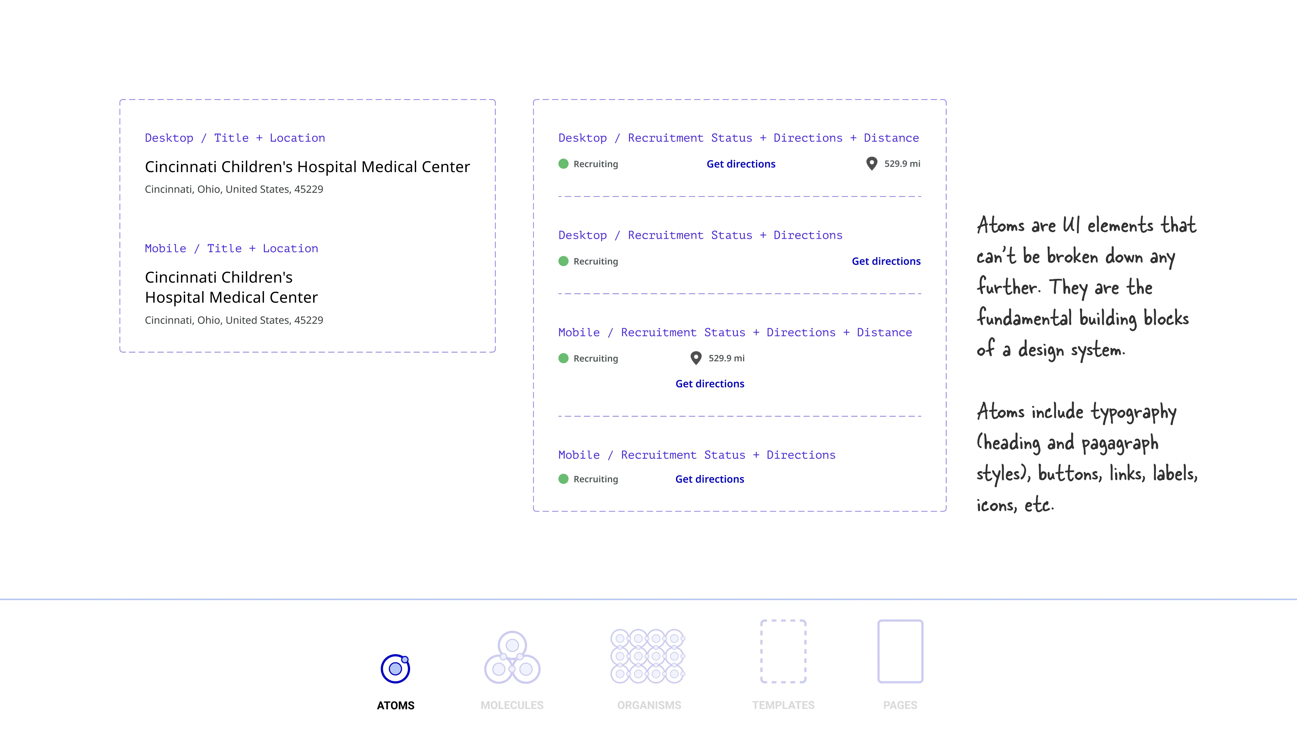
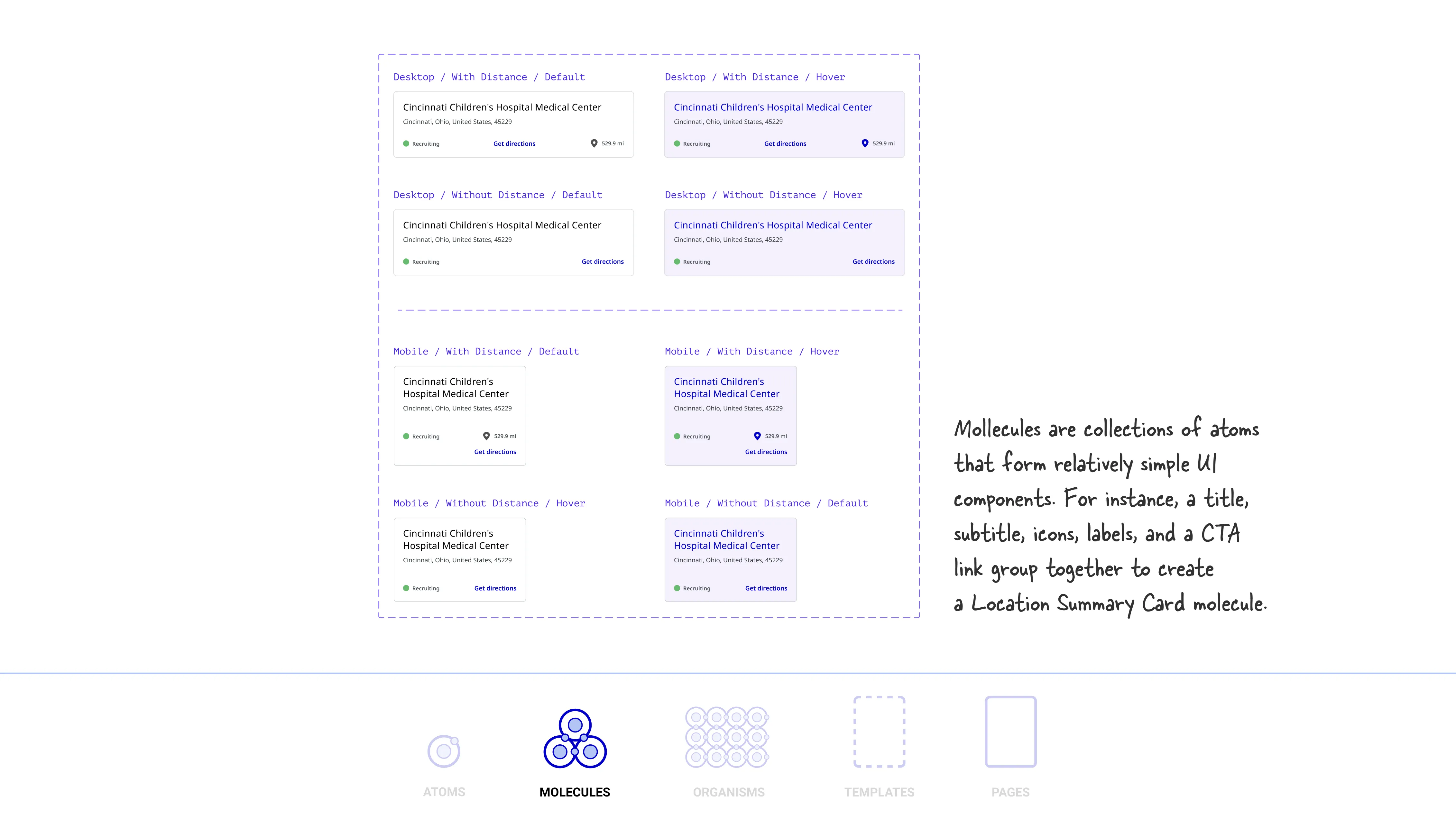
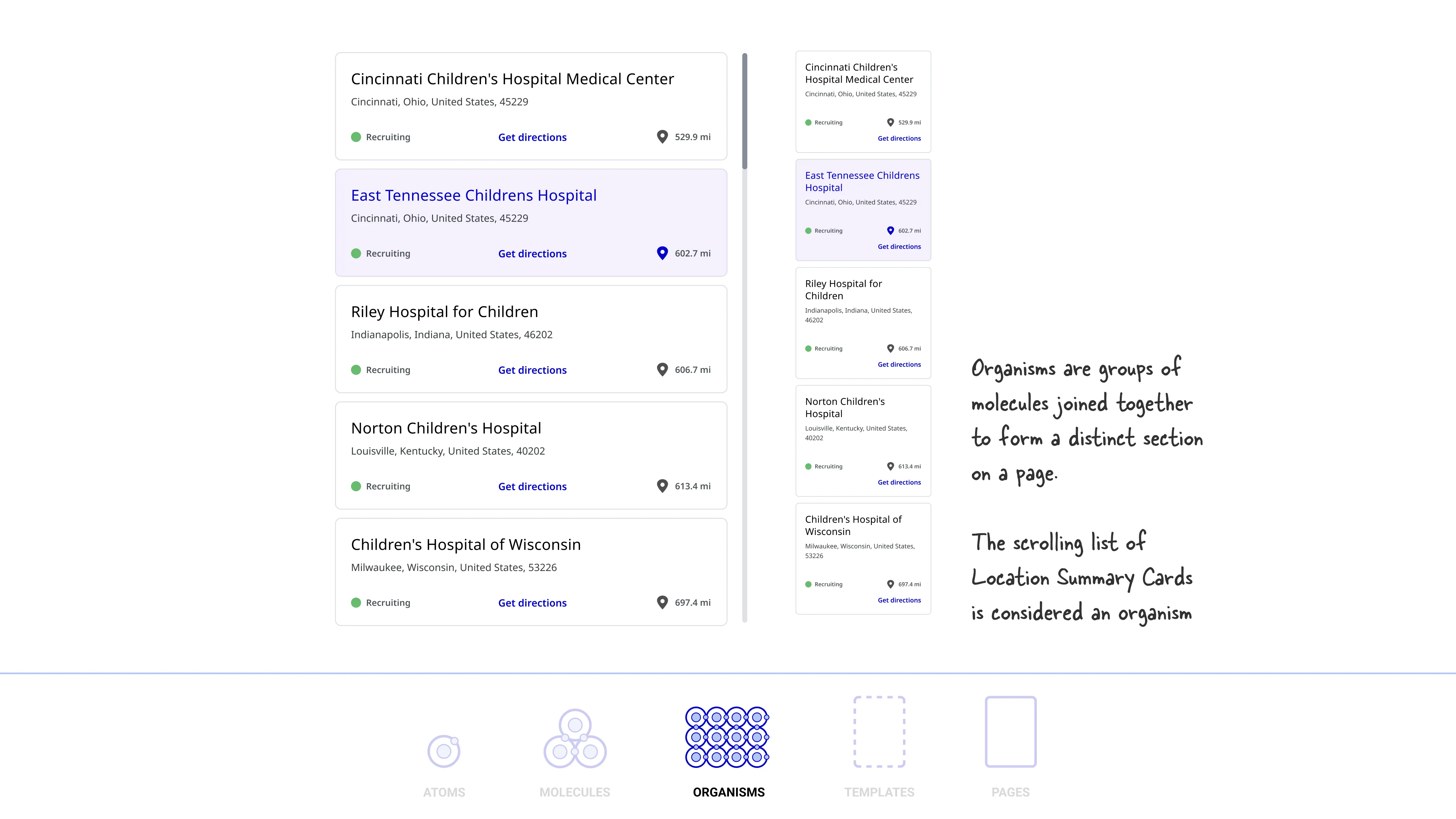
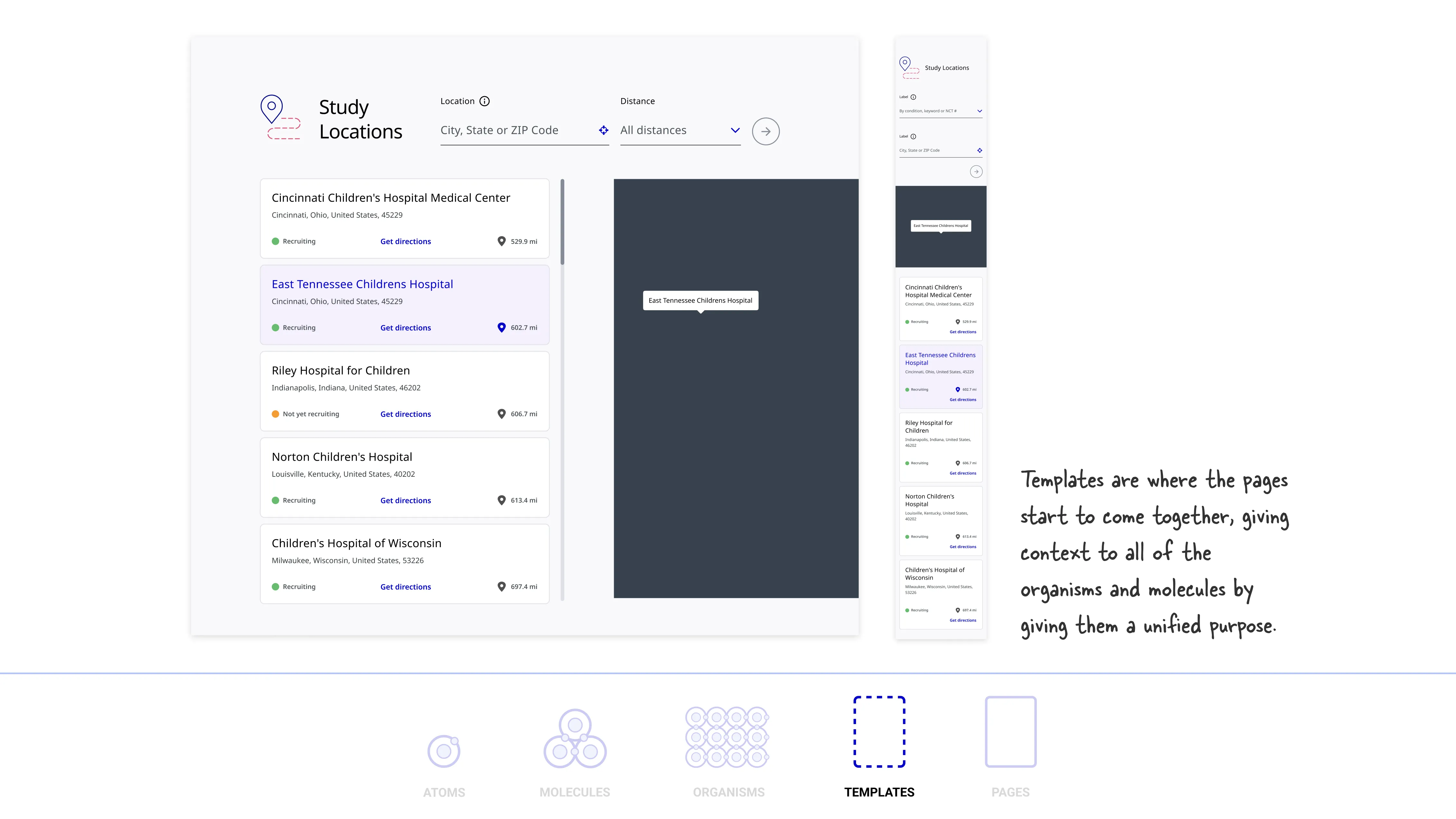
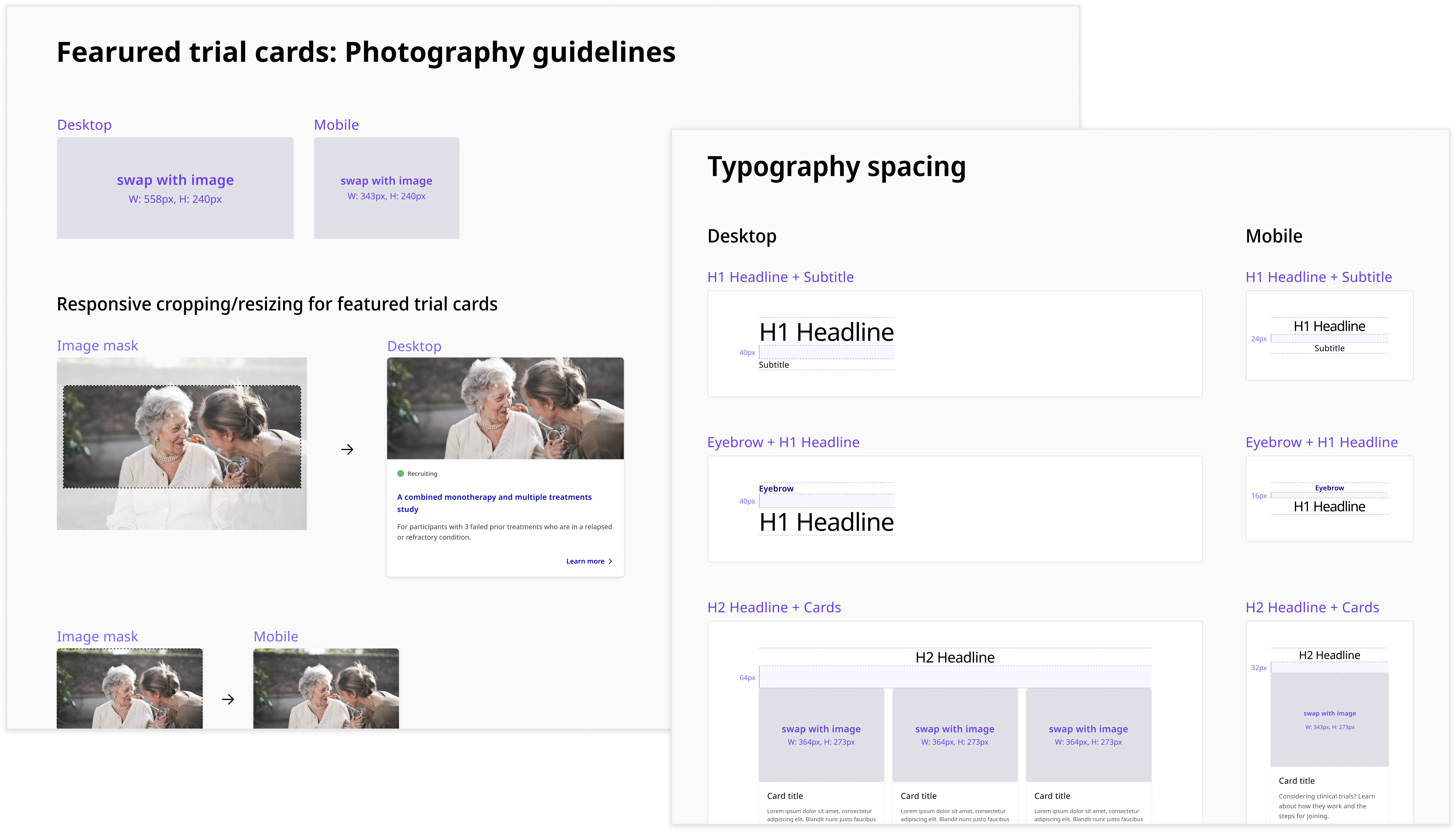
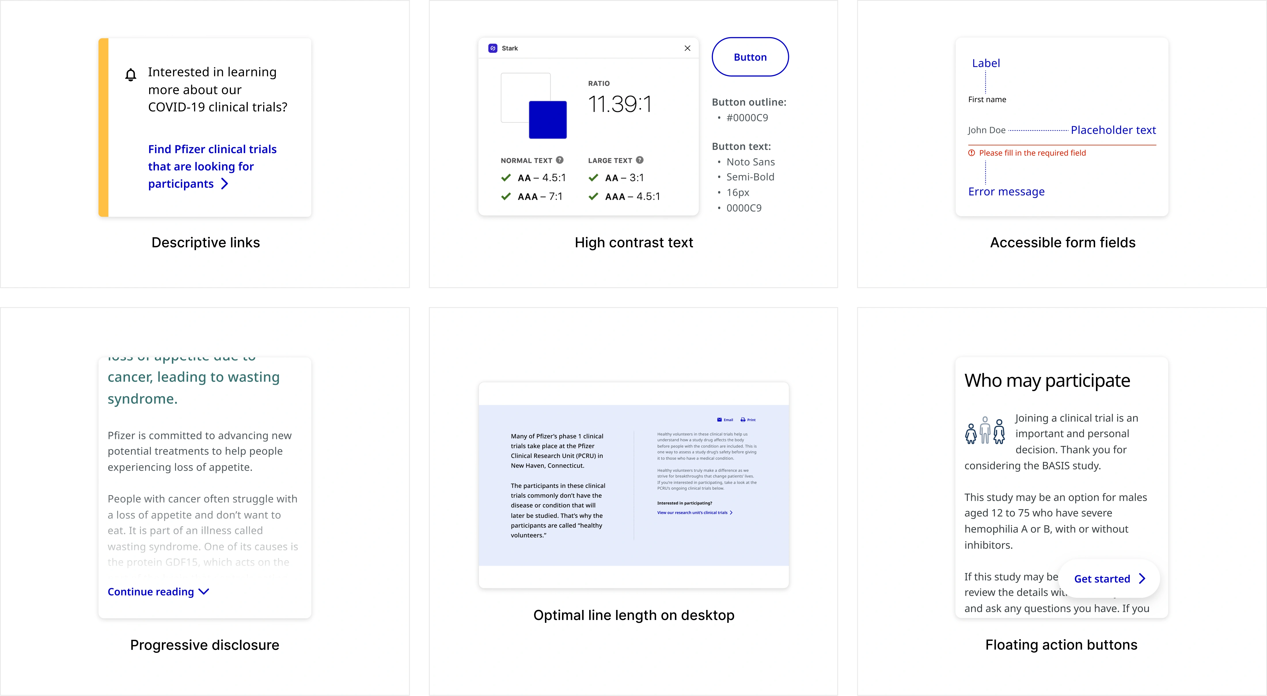
Building a design system from the ground up

Pfizer's first major rebrand in 70 years demanded a full site redesign, but the existing Sketch-based workflow couldn't keep up. I co-led the migration to a unified Figma design system alongside one other designer, building 680+ components across 40+ pages while contributing to the redesign itself, resulting in a scalable, documented system that shipped on schedule and became the single source of truth for design, product, and engineering.

Design Systems Figma Migration Component Library Token Architecture Healthcare UX
Pfizer clinical trials site on desktop and mobile
My Role
UX/UI Designer
Company
VMLY&R for Pfizer
Deliverables
Component Library, Documentation, Website Redesign
Impact
680+ components across 40+ pages

A fragmented workflow across four disconnected tools

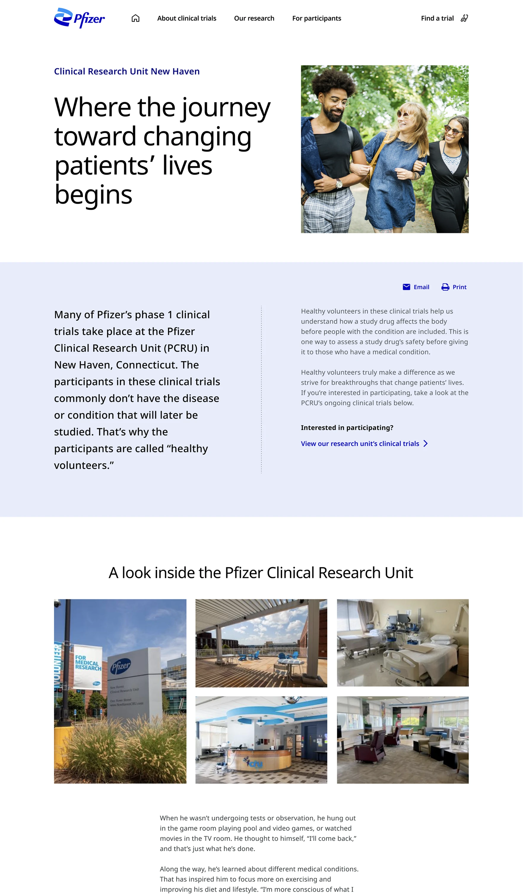
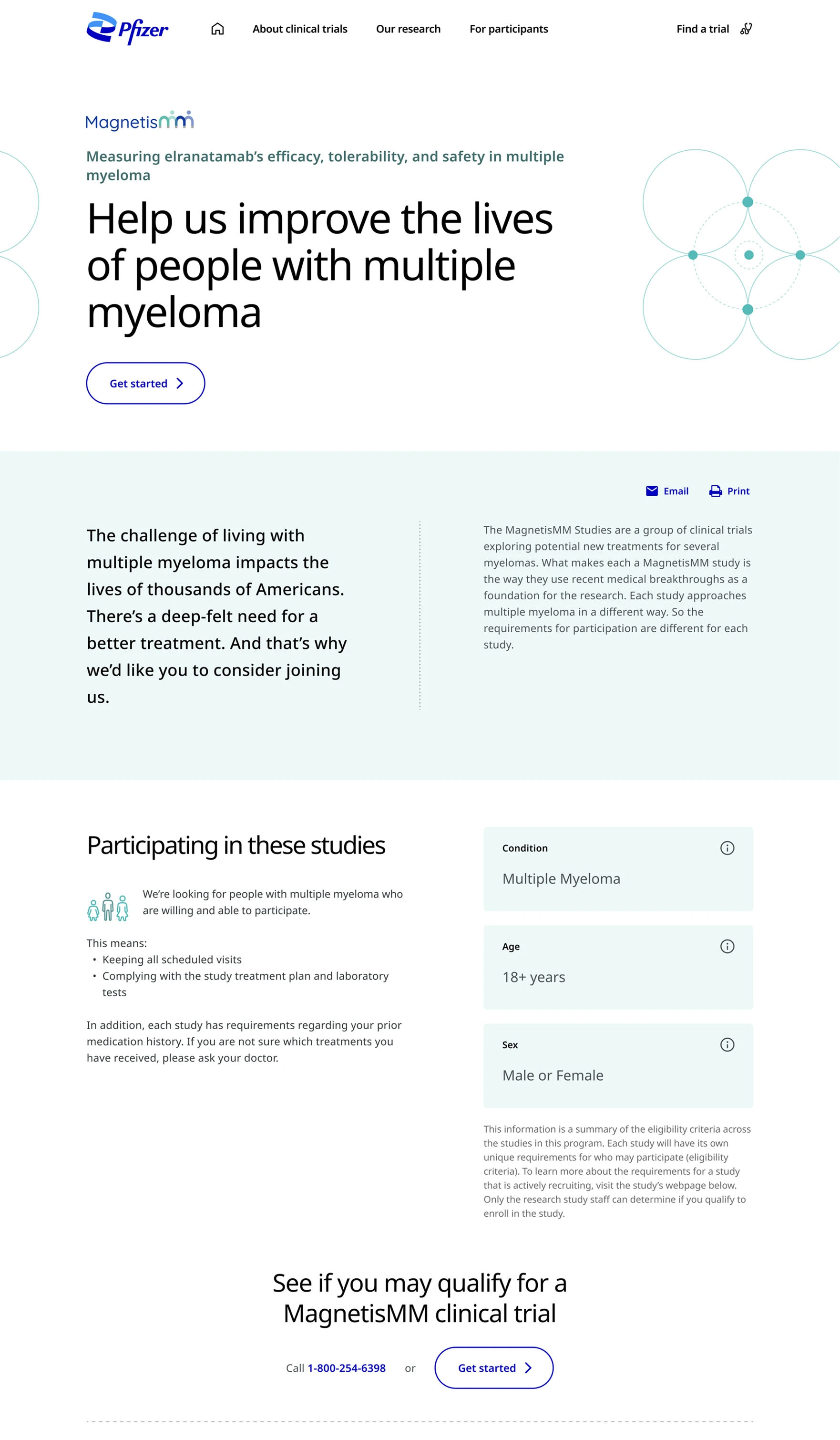
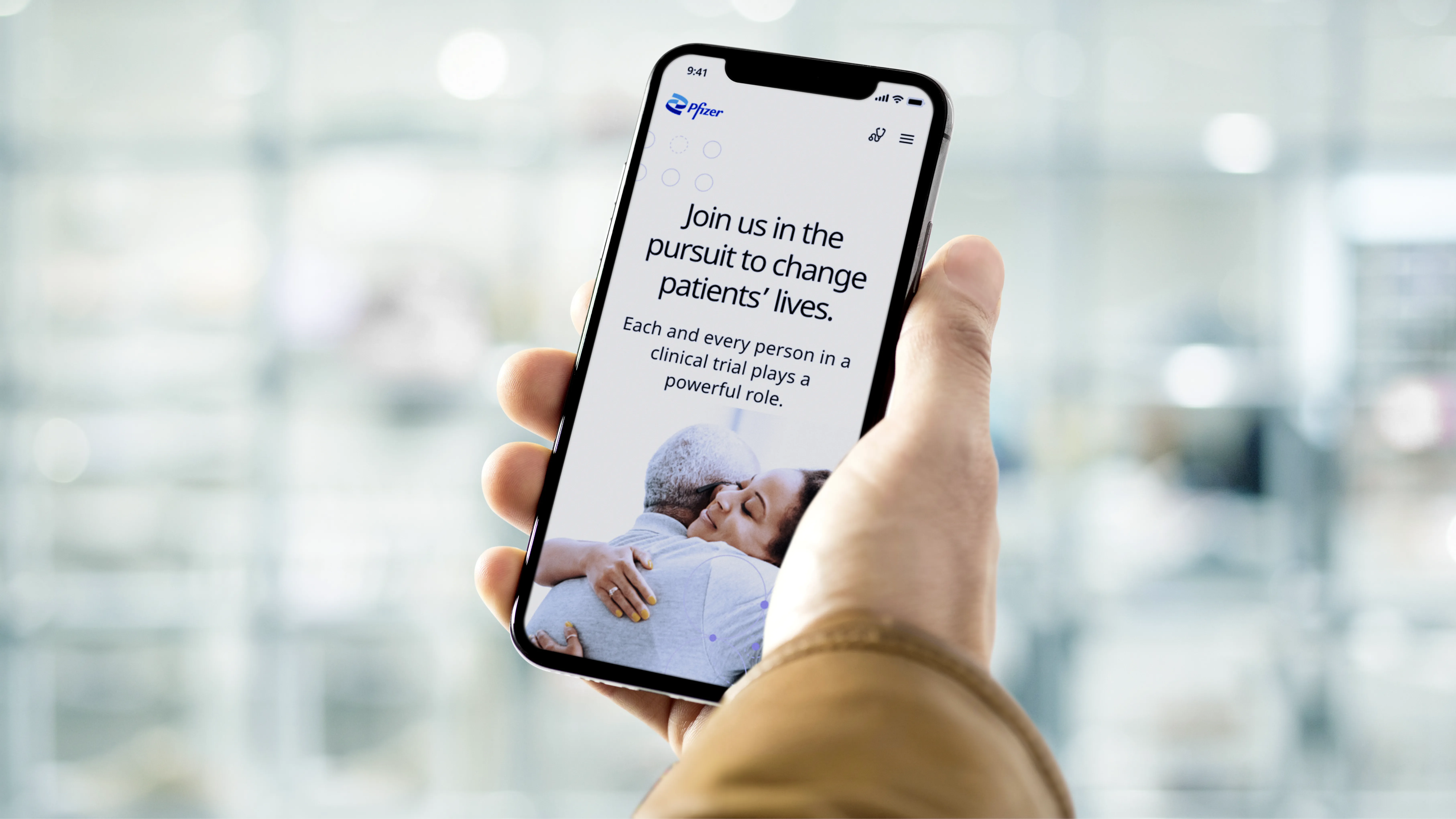
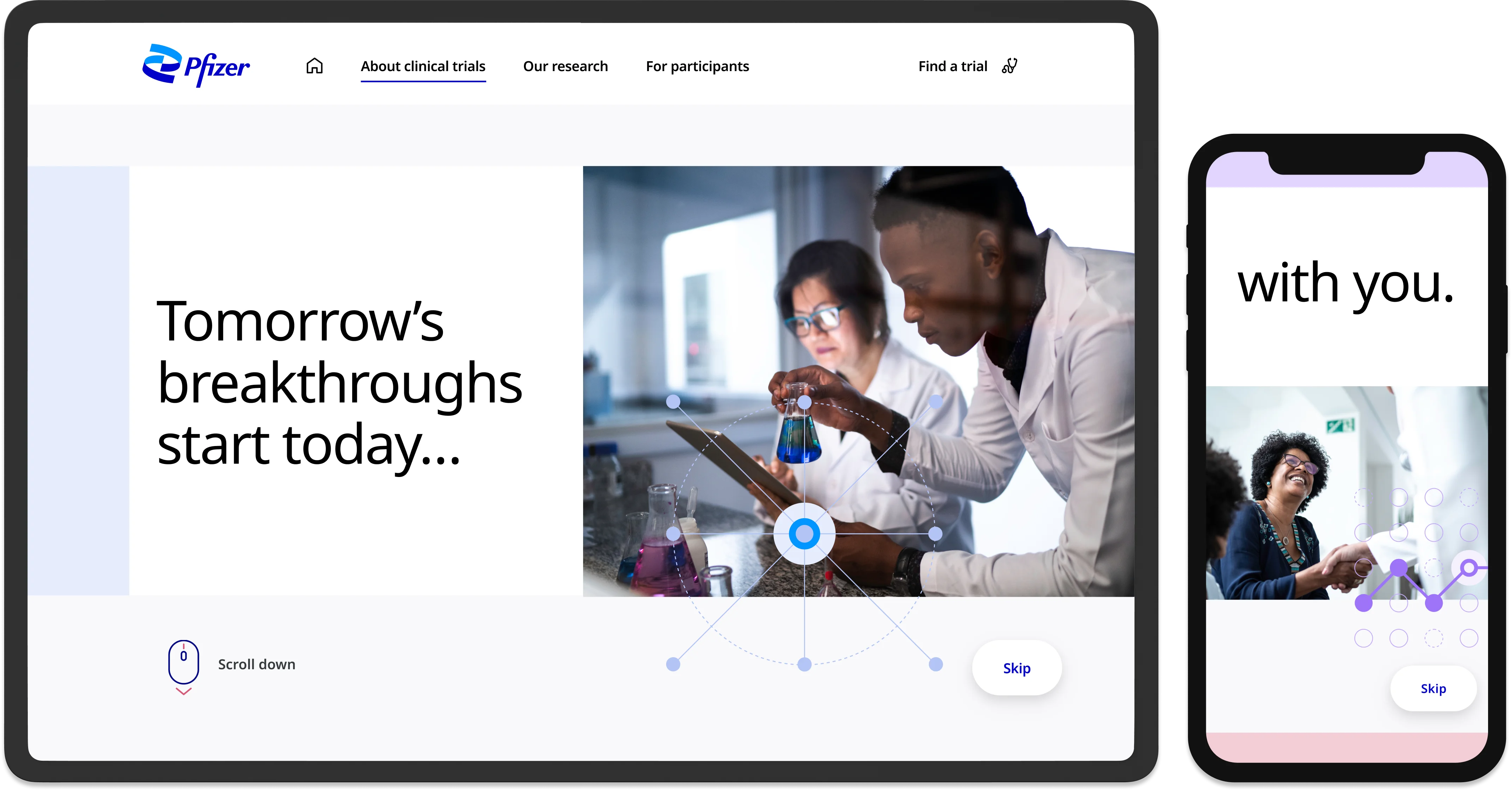
Pfizer's clinical trial recruitment site helps users explore past, current, and upcoming studies. In early 2021, Pfizer unveiled its first major rebrand in 70+ years and asked VMLY&R to redesign the site accordingly.

The previous site relied on a Sketch-based component library. Our workflow was fragmented across four tools: Sketch, Abstract, InVision, and Zeplin. This led to crashes, versioning confusion, and productivity loss under tight deadlines.

How I approached the migration

With a tight timeline and a simultaneous website redesign underway, I needed a clear, repeatable process to build the new system without losing momentum. I broke the work into ten phases, from user research and benchmarking through to component build, accessibility, and documentation.

Who uses the system and who uses the site

Our design system users included designers, developers, brand teams, marketing, product owners, and senior stakeholders. Primary users of the website were potential trial participants and caregivers. Understanding these two distinct audiences shaped how we structured the system's documentation and flexibility.

From atoms to pages: a shared design language

I researched Atomic Design, Brad Frost's methodology for breaking UI into small, independent components: atoms, molecules, organisms, templates, and pages. This framework gave us a shared vocabulary and a principled structure for building the new component library.

Applying atomic design to components

I applied atomic design methodology to analyze each component individually and within the broader system. Below is the clinical trial location card I designed for both desktop and mobile, followed by a breakdown of its structure using atomic design.

Desktop / Default State
Mobile / Default State
Desktop default state of the location summary card Mobile default state of the location summary card
Atoms
Molecules
Organisms
Templates
Pages

Benchmarking industry design systems

I studied the design systems of leading companies, including Atlassian, Salesforce, and Microsoft, to learn about design system best practices and how we should structure our own design system.

Design System Examples

Interface inventory

I worked with a teammate to audit the existing Sketch library, cataloging every button, card, text style, and spacing rule. This exercise surfaced inconsistencies like undefined spacing, conflicting font weights, and duplicated component variants. The audit was the foundation of everything that followed.

Interface Inventory

Mapping to Helix 2.0

My team started with Helix 2, Pfizer Digital's shared component library, but quickly found clinical-trial-specific needs (trial cards, location components, eligibility filters) that required custom work. We used Helix as a foundation and built tailored components on top.

Old homepage cards
Old homepage cards
Helix 2 components in Figma
Helix Figma file
New homepage cards
New homepage cards

Creating separate Figma files

I collaborated with two designers to streamline file organization for the clinical trial redesign. We built a reusable component library and structured Figma files for clarity and flow: one for internal iteration, one for client review, and two for post-launch updates as the design system evolved.

Figma Setup
Example of the file structure that I helped establish

Setting up the component library

We decided against importing from Sketch. Messy layers and broken layout logic weren't worth the shortcut. Instead, we rebuilt directly in Figma using Helix as a reference. This gave us clean, scalable components from day one and a library purpose-built for the clinical trials experience.

Style guide created in Figma
Scalable card component variations
Featured component showcase

Documentation and guidance

I created detailed documentation in Figma to ensure long-term system clarity for developers and future designers. This included component usage guidelines, design rationale, accessibility notes, and instructions for maintaining the system as it evolved.

Design System Documentation

Accessibility built into the foundation

Accessibility and inclusivity were core to the experience from day one, not a final check. Design, copywriting, and code were all held to WCAG standards throughout. Building this into the component library meant every team working from it inherited those constraints by default.

Accessibility Visual Highlight

Supporting every stage of the journey

The system was applied across recruitment experiences, disease program pages, search, and trial discovery workflows, showing how the library created consistency across multiple product touchpoints.

Pfizer Clinical Research Unit

Pfizer Clinical Research Unit (PCRU)

Program Level Recruitment

Program Level Recruitment

Find a Trial

Find a Trial (FAT)

Condition Page

Condition page

Built for every touchpoint

Find a Trial

Search & filter experience

Standardized layouts and interactions for the trial search tool, making it predictable across conditions, locations, and filter states.

Program Level

Recruitment pages

Modular content templates for program-specific study pages, enabling consistent layouts with flexible content slots.

Participant journey

Steps & onboarding

Reusable card and step components for the participant onboarding flow, from sign-up through clinical research unit pages.

From component to experience

With the library built and documented, the real test was applying it. Reusable components streamlined key user journeys, improving clarity and enabling more seamless clinical trial exploration and sign-up. From the Find a Trial search experience to program-level recruitment pages, the system held up across every touchpoint: consistent, predictable, and built to scale.

Study Locations component variations across desktop and mobile, with and without distance, default and hover states
Reusable component variations designed for flexibility across use cases
Study Locations feature shown on tablet and mobile device mockups

From fragmented library to a unified system

Migrating from four disconnected tools to a single Figma system improved how every team worked. The interface audit was critical in enabling effective planning and resource allocation, laying the foundation for a scalable, maintainable system that improved consistency and delivery across teams.

680+
Components built
Spanning 47 distinct component types, rebuilt from scratch in Figma
40+
Pages redesigned
Covering the full clinical trial recruitment journey across device types
Jan '22
Site launched
pfizerclinicaltrials.com went live on schedule with the new design system

A system that shipped and scaled

The new component library in Figma played a significant role in the successful redesign of pfizerclinicaltrials.com, which launched in January 2022 on schedule. Beyond the launch, the system improved how teams worked day-to-day.

Before
  • 4 disconnected tools, constant context switching
  • Inconsistent components across pages and teams
  • No documentation or governance model
  • Duplicated work and slow handoffs
After
  • 680+ components, single Figma source of truth
  • Consistent UI patterns across 40+ pages
  • Clear documentation and usage guidelines
  • Accelerated delivery and reduced friction

What I'd do differently

The initial timeline assumed 680+ components could be built in 7–14 days. In hindsight, that was optimistic. The migration took significantly longer, partly because we were simultaneously executing a full website redesign, so the component library and new page designs evolved in parallel, requiring rework as upstream decisions changed.

Next time, I'd push for a phased rollout from the start: core atoms and high-priority templates first, expanding outward after. This would reduce rework and give the team clearer milestones.

Pfizer Clinical Trials on mobile
Available for work
Interested in working together,
or simply want to say hi?
Jacqueline O'Connor, 2026